> ## Documentation Index
> Fetch the complete documentation index at: https://docs.ilyama.golain.io/llms.txt
> Use this file to discover all available pages before exploring further.
# Linking transforms to panels
> Map transform output columns onto line, bar, XY line, gauge, and stat/KPI charts.
Once a transform produces the columns you want (see [Transforming panel data](/console/dashboards/transforms)), the **Build** tab's visualization settings map those columns onto the chart. Different chart types read different mappings.
## Which mapping each chart type uses
| Chart type | Reads |
| ------------------ | ----------------------------------------------------------------------- |
| Table | Whichever columns you add to **Table columns** |
| Line / Bar / Area | **X axis columns** + **Y axis columns** |
| XY line | An explicit **X** column + **Y** column (both numeric — not time-based) |
| Gauge / Stat / KPI | A single **Measure** column, mapped internally to `value` |
Transform output columns always appear in these pickers **after** the raw table columns — scroll to the bottom of the list.
## Walkthrough: bar chart from an unnested array
This continues the `cell_idx` / `cell_voltage` transform from the previous page.
In the **Build** tab, set **Visualization** to **Bar chart**.
Click into **X axis columns**. Raw table columns are listed first; transform outputs (`cell_idx`, `cell_voltage`, …) are at the bottom.
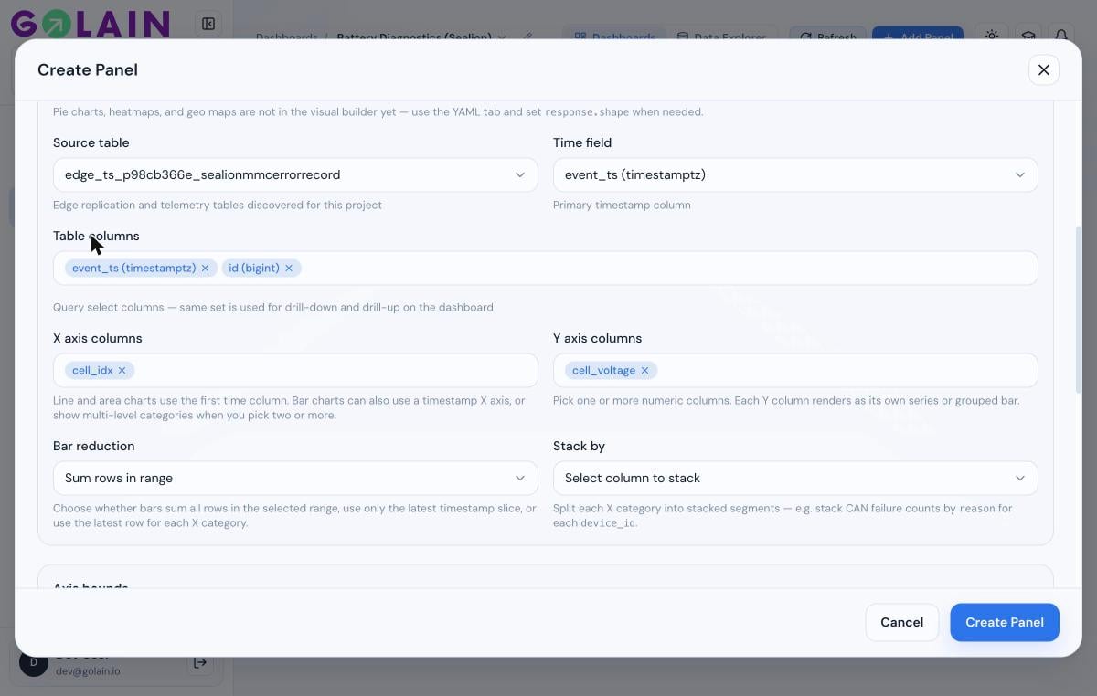
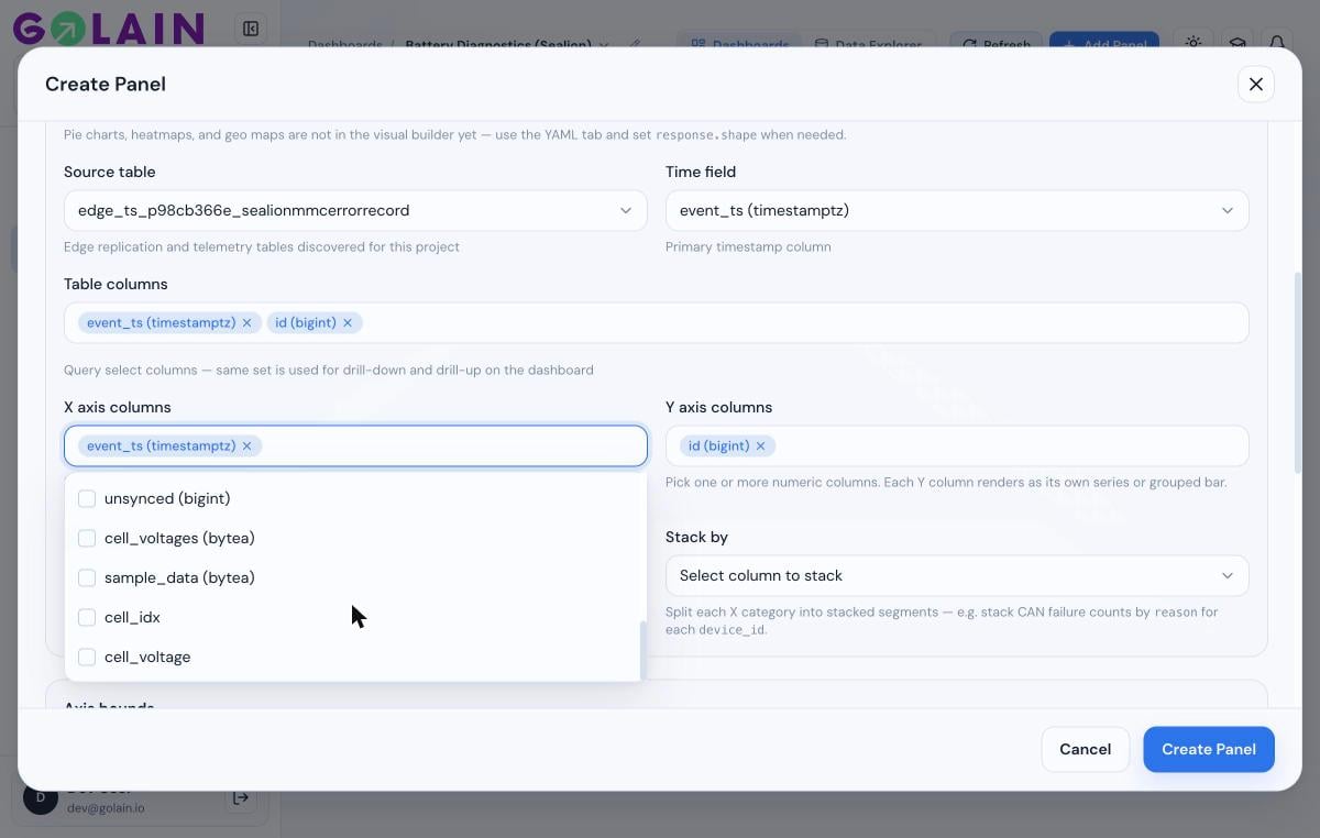 Uncheck the default raw column, check `cell_idx` for X. Do the same for **Y axis columns**, selecting `cell_voltage`.
 Scroll down — the **Preview** pane renders against your actual data as soon as both axes are mapped.
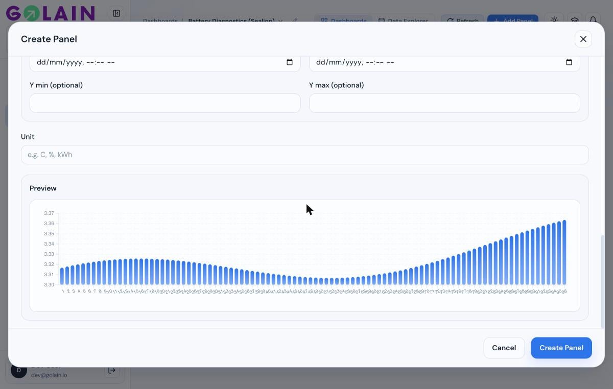 Click **Create Panel** (or **Save** on an existing panel).
## Walkthrough: gauge / stat from an aggregated value
Gauge and Stat/KPI panels show a single number, so your transform should produce exactly one row with one numeric column.
Alias your output column to `value` — it's the field the gauge falls back to by default:
```sql theme={null}
WITH latest AS (
SELECT * FROM raw ORDER BY event_ts DESC LIMIT 1
)
SELECT avg(u.v) AS value
FROM latest, unnest(cell_voltages) AS u(v)
```
Set **Visualization** to **Gauge** (or **Stat / KPI**).
Set **Measure** to your transform's output column (`value`, or whatever you aliased it to).
Under **Gauge settings**, set **Min Display** / **Max Display** to a range that fits your metric — the defaults (0–100) suit a percentage, not a raw voltage or count. For a 0–100% SoC value, the defaults are already correct.
There's a known picker issue where selecting a transform-output column as **Measure** on a Gauge/Stat panel can snap back to a raw column instead of holding your selection — which then renders as `0` because that raw column doesn't exist in the transformed row. If this happens after following the steps above, see [Troubleshooting: gauge or stat shows 0](/console/dashboards/troubleshooting#gauge-or-stat-shows-0) for the current workaround.
## Next step
Panel shows "No data", a chart reads 0, or a transform column won't map.
Click **Create Panel** (or **Save** on an existing panel).
## Walkthrough: gauge / stat from an aggregated value
Gauge and Stat/KPI panels show a single number, so your transform should produce exactly one row with one numeric column.
Alias your output column to `value` — it's the field the gauge falls back to by default:
```sql theme={null}
WITH latest AS (
SELECT * FROM raw ORDER BY event_ts DESC LIMIT 1
)
SELECT avg(u.v) AS value
FROM latest, unnest(cell_voltages) AS u(v)
```
Set **Visualization** to **Gauge** (or **Stat / KPI**).
Set **Measure** to your transform's output column (`value`, or whatever you aliased it to).
Under **Gauge settings**, set **Min Display** / **Max Display** to a range that fits your metric — the defaults (0–100) suit a percentage, not a raw voltage or count. For a 0–100% SoC value, the defaults are already correct.
There's a known picker issue where selecting a transform-output column as **Measure** on a Gauge/Stat panel can snap back to a raw column instead of holding your selection — which then renders as `0` because that raw column doesn't exist in the transformed row. If this happens after following the steps above, see [Troubleshooting: gauge or stat shows 0](/console/dashboards/troubleshooting#gauge-or-stat-shows-0) for the current workaround.
## Next step
Panel shows "No data", a chart reads 0, or a transform column won't map.