

Which mapping each chart type uses
Transform output columns always appear in these pickers after the raw table columns — scroll to the bottom of the list.
Walkthrough: bar chart from an unnested array
This continues thecell_idx / cell_voltage transform from the previous page.
1
Set the visualization type
In the Build tab, set Visualization to Bar chart.
2
Open the X axis columns picker
Click into X axis columns. Raw table columns are listed first; transform outputs (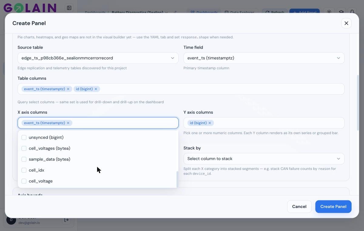
cell_idx, cell_voltage, …) are at the bottom.3
Map X and Y to the transform output
Uncheck the default raw column, check 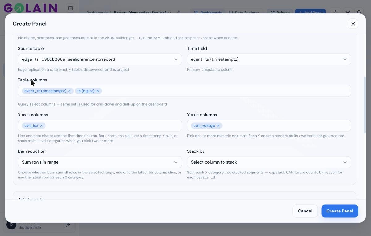
cell_idx for X. Do the same for Y axis columns, selecting cell_voltage.4
Check the live preview
Scroll down — the Preview pane renders against your actual data as soon as both axes are mapped.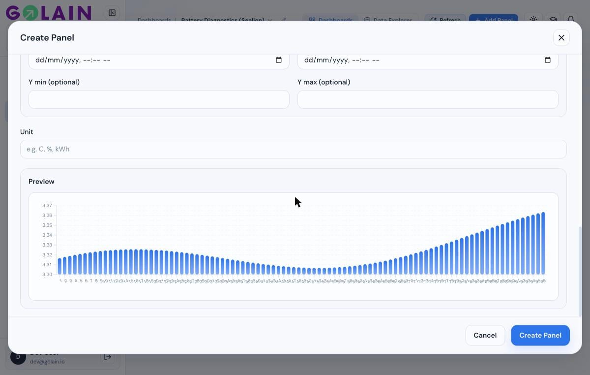
5
Save
Click Create Panel (or Save on an existing panel).
Walkthrough: gauge / stat from an aggregated value
Gauge and Stat/KPI panels show a single number, so your transform should produce exactly one row with one numeric column.1
Write a single-value transform
Alias your output column to
value — it’s the field the gauge falls back to by default:2
Set the visualization type
Set Visualization to Gauge (or Stat / KPI).
3
Set the Measure
Set Measure to your transform’s output column (
value, or whatever you aliased it to).4
Set Min/Max Display
Under Gauge settings, set Min Display / Max Display to a range that fits your metric — the defaults (0–100) suit a percentage, not a raw voltage or count. For a 0–100% SoC value, the defaults are already correct.
Next step
Troubleshooting
Panel shows “No data”, a chart reads 0, or a transform column won’t map.