

How a panel gets its data
- QueryScript query — selects columns and a time window from a table. Built visually (Build tab) or written directly (QueryScript YAML tab).
- Transform SQL (optional) — a DuckDB-WASM SQL step that reshapes the query’s rows in the browser before charting. See Transforming panel data.
- Chart — the visualization reads whichever columns come out of step 2 (or step 1, if there’s no transform). See Linking transforms to panels.
Create a dashboard
- Open your project → Dashboard → Dashboards.
- Click New Dashboard, name it, and save.
- Click Add Panel to add your first panel.
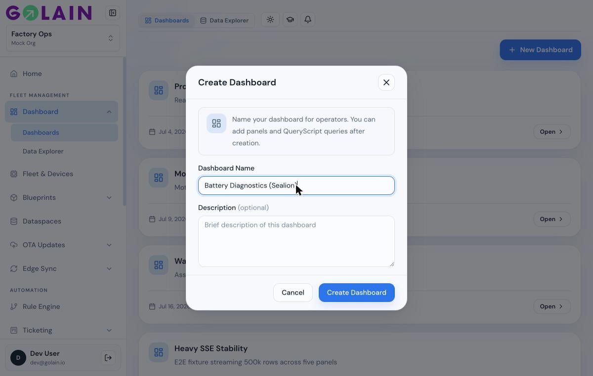
The panel editor
Every panel (new or existing) opens the same editor with three tabs: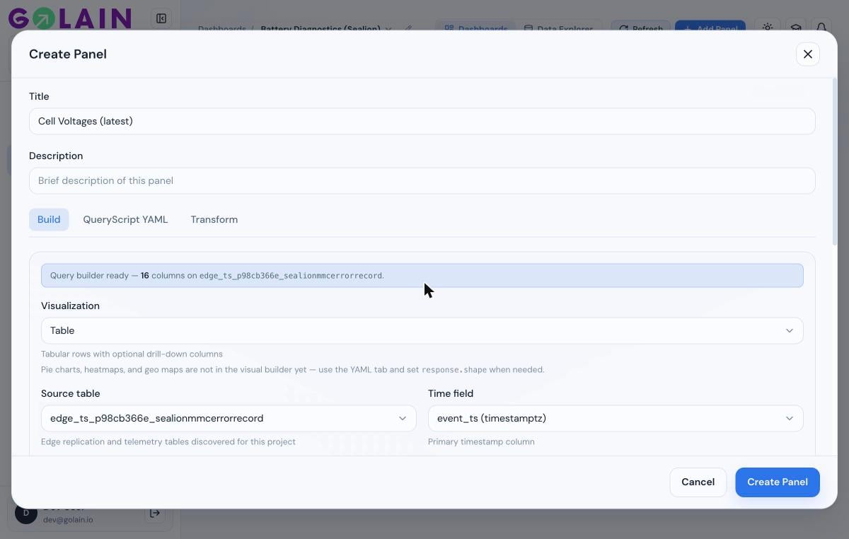
Next steps
Transforming panel data
Decode encoded columns and reshape rows with DuckDB SQL.
Linking transforms to panels
Map transform output columns to line, bar, XY line, and gauge/stat charts.
Troubleshooting
Panel shows “No data”, a chart reads 0, or a column won’t map.